
In what ways does my media product use, develop or challenge forms and conventions of real media products?
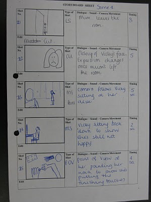
When shooting we created space to produce an atmospheric film. We avoided using long shots to symbolize that our character Vicky is deprived of space. Close ups and medium shots were applied to the film to help the audience understand how entrapped she is. This entices the audience and draws them in to believe that she is having problems; by using effective camera shots her emotions flood out through the film to the viewers.
In the scene where Vicky pours wine into her glass we used a high angle medium close up shot to show this as soon as the wine touches the glass the music starts. This results in the two conventions working together. When these two conventions are joined together it normally indicates a party whereas in this case she isn’t it’s the complete opposite.
Our film follows a simple narrative structure although we didn’t include a resolution. We focused on the climax. Throughout this film we built up the impression that everything is okay and she is getting ready for a good night, but in reality it becomes clear that this is not the case as we leave it on such a climax, this is an unexpected situation that no one saw coming.
We purposely didn’t resolve the ending, as this would enable us to create a sequel where this could allow the audience to create their own conclusion. Also by doing this we didn’t demean our target audience through leaving them with a dull and unexcited finish to the film.
In a conventional approach we used a sound at the beginning of the film that give off a desolate mood to enhance the atmosphere. We achieved this by filming in a silent house which therefore created a sense of suspense. Additionally this made the viewers assume that they should be listening out for something.
Throughout our film there is no dialogue. This enabled us to challenge to usual conventions of sound. We produced this quietened effect as it represents our characters personality since she likes to have her privacy and keeps her thoughts to herself. The non-diegetic sound we used was a soundtrack by Katy Perry (Fingerprints). Even though this song has a buoyant track, the lyrics reconfirm the characters hidden personality with silent messages in the song such as “I want you to remember me, I’m leaving my fingerprints”.
Our character is shown wearing simple clothing which implies that she just blends in with the background instead of standing out in a crowd. We chose this mise- en-scene as it symbolizes the character she is.
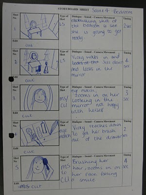
In reality a normal teenager’s bedroom is often messy and unkempt. Therefore in keeping the bedroom props untouched we were able to keep the effect realistic in this circumstance. By doing this, the target audience were able to relate to what was going on; consequently this enabled them to gain a better understanding of what was being portrayed. We tested the convention as we built up a suspense that she was going out for the night. We depicted this by her getting dressed up and putting make up on whilst drinking a glass of wine. Whereas at the climax the viewers slowly start to find out that she is actually going no where. This symbolizes that there is something wrong. We chose to use this performance as it tricks the audience and keeps them hooked as they will now want to know what is happening. It also shows that the character has put on her own act trying to convince herself that she is happy when she is clearly not.
When we come to editing our film we used conventions of fading and dissolves. We inserted this when she was getting changed as we didn’t want to just watch her get changed into different clothes as that would have just bored our audience so we added fades/dissolves in so it showed the passing of time. As it showed the passing of time it also told the viewers how much time and effort she was putting in to get ready and look nice.
How effective is the combination of my main product and ancillary texts?
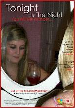
Our poster has been set out and constructed in a way where it shows correlation to our film in the terms of the brand identity which ours is a drama although it’s more for the eyes of a female this is portrayed in ways of the image, language and design. The main focus on our poster is the image of our main character Vicky where she is looking into a mirror showing us her back and her reflection in the mirror. This resembles two identities as such since there is a reflection and there’s reality. The reflection just shows the audience her facial expression whereas it doesn’t show you or tell you what is going on in her mind in reality. The picture we perceive in the mirror is of her face looking serious and thoughtful this signals to the audience that there maybe some drama during this film as well as something depressing.
The language on our poster reflects off the image in most cases as our title ‘Tonight is the Night’. This is informing you that something is going to happen tonight and judging by her picture it’s likely to be bad. In addition to this the tagline ‘You will remember’. Also it clearly states that whatever happens in this film will be something that you won’t forget easily straight away gives off bad vibes. The two quotes ‘Opened my eyes to things I never thought of’ along with ‘Thought provoking and interesting’ gives off the impression that maybe not everything is how it seems, relating back to the mirror portraying two identities.
The design to our poster is basically the main factor to the film being mainly aimed towards women as you can see a lot of pink like her walls, lipstick, cheek make-up and vest strap is pink representing feminine. Besides the pink there is also the colours red and white, now the colour red has a lot of meanings that you can associate it with some being love, lust, jealousy and danger. Therefore by putting this colour into our poster it again reflects a sense of drama. The colour white is quite a blank and boring colour which doesn’t really give a lot away which additionally goes back to the point of not showing you what’s really going on inside Vicky’s mind.
We created a magazine feature which is essentially a review on our film; we did this as it gives our target audience an enhanced understanding and insight about it. The main image on our feature is a medium shot of Vicky; the picture depicts her facial features as blank and confused, this gives the impression that she doesn’t really know what to do with herself or even worse what to herself. This straight away tells the audience a lot about the character as well as the film, because just by looking at that image we can conclude that the actions Vicky fulfils during this sequence is maybe a rash one as she is mystified within herself. There are also hints that this film is aimed at mainly females as in our feature the colour pink is in the background of the picture, and pink make-up is used on Vicky’s cheeks to emphasise on this to make sure we attract our desired target audience. We decided to add red in the review so this can contrast the drama in our film since red is associated with connotations of love, danger, anger and lust.
In terms of the language in our feature, we chose to use simple and relaxed language as this would help us draw in the audience we want which is young individuals predominately female. We included information on the plot of our film which is a seventeen year old girl getting ready for what appears to be a night out. This evidently appeals immediately to young girls, as we read on we discover that the director’s main focus is the effort in making Vicky look attractive; this revaluates that this we are attempting to draw in young females. In addition to this, we thought if we have the language simple and informal we can relax the viewers at the same time. This has a huge impact on the climax of the film as there is an incredible twist and by them being relaxed this makes it a greater shock for them. There is a quote in the feature stating that the film is “thought provoking”. This line makes you think of other sides to a teenager’s life and that it isn’t as easy and fun as everyone assumes and in this case especially for girls. This piece of language obviously relates towards young girls as they know what this girl must be going through.
How did I use media technologies in the construction and research, planning and evaluation stages?
Adobe Premiere
Positive - What did the software allow you to do make your film better?
Adobe Premiere allowed me to add in special effects like fades and dissolves the outcome of me having the privilege to use these luxuries was my work looked more professional as well as plays more swiftly and efficiently. This software also allowed me to cut out any bits that I did not need or was not at the standard as the rest of the production this benefited me in ways that my film had a consistent flow and went from one scene to another quickly and smoothly. In addition to this, my film had a limited time that I had to comply with so being able to cut down on my film resulted in me achieving this.
Negative – Identify a problem with the software and how did you overcome the problem?
Although this software mainly benefited me, it did have its complications too. The core problem I endeavoured was downloading the music/soundtrack to the film. This became time consuming and frustrating as the program was just rejecting it, in the end I was able to insert it after many times of trying. Additionally, the problems that I had with Adobe Premiere were with the sound all together as even adjusting the volume wasn’t easy so this was a consistent difficulty.
Blogger.com
Positive – What did the blog allow you to do?
This website allows me and other members my group to view each other’s as well as other individuals blogs. This can help inspire you and help you develop on your own ideas and blog. Blogger also allows you to upload images and change backgrounds and font colours to make your blog more interactive and exciting, in addition to this you can help make your blog represent the type of genre your film is based on.
Negative
Although blogger is helpful in many ways, it also has its negatives one of these being the difficulty in arranging images that you have uploaded onto it. This can get frustrating as when trying to move the images in to an appropriate order images seem to get misplaced and muddled up with each other.
What have I learned from my audience feedback?
After screening our film to our target audience which is 14-18 year olds, predominately females they come to the conclusion of the following responses.
This shows that the majority of the audience was correct about what genre our film was, which shows that our film was structured and portrayed correctly in the terms of the drama genre. Although 12% did think it was a chick flick, this maybe due to the elements of make-up, girlie clothes and the colour pink be shown quite a bit. In addition to this, overall we used the basic conventions of a drama e.g. using a real setting with a normal everyday life person. However if I were to do this task again I would maybe concentrate more on the main characters thoughts and feelings rather than her doing her make-up and trying on clothes, as this may have been a distraction towards our audience on what genre our film really was.

The results above clearly show that our music was extremely effective as only 2% thought that it was ineffective, which is a massive success. This helps ease our mind as we know that the audience we targeted agreed that the song Katy Perry (Fingerprints) helped emphasise on our production as well as fit in with the genre we was constructing the film on. The 2% that did not think the song was appropriate maybe due to that the song can come across a bit girlie maybe putting off certain viewers; the song is also a little upbeat which maybe confused them a little due to how the film is made. Nevertheless, overall we are pleased and feel that we made a good choice on the music.


 The image above shows alot of pink symbolising she is a proper girly girl it also shows her as innocent. Although it shows her quite deep in thought which gives the audience a slight impression that something is on her mind which can stop us from achieveing the massive twist at the end.
 The second image is quite dark therefore not giving too much away about her personal identity. Also the picture shows a stern look on her face with a slender smirk this doesn't make it easy for the audience to assume what is going to happen resulting in our twist to still be effective.
 The third image shows us that she is quite feminine as she has pink walls and her face has a significant amount of make up on it which is good as it represents that this film is about young females. The image also shows her face as plain it doesn't really show any emotion which again doesn't give the audience any kind of clue what is going to happen later on in the film. This was the picture we choose to have for our magazine review.


