Tonight Is The Night

Tuesday, 26 January 2010

REVIEW - editing final product

EDITING FINAL PRODUCT

When it come to the final product we had to look at what layout and picture we wanted to use and match them togther. By doing this we had a basic outline for a poster once we had done this we could start editing and impoving it to a acceptable level where is could pass for a sophisticaed film review. By editing the product we had to look at a variety of pictures and layouts and see what ones went best together after we found our favourite and put them both together we had made a successful product and review page.


The image above is our magazine film review after we had found all the appopriate elements to make a convincable end product.

REVIEW - drafting layout

DRAFTING LAYOUT

Our layout had to be professional and have the correct conventions to get it as close to a real magazine article as possible. This involved these conventions a good clour scheme, a suitable layout and a appropriate font type which would go well with our film as well as our magazine review.

REVIEW - choosing most appropriate images from film

CHOOSING MOST APPROPRIATE IMAGES FROM FILM

When we came to choosing the appropriate image for a film review, we had to make sure the image was going to fit in with our film well as well as target the the audience we wanted to attract.,we wanted the picture to show feeling and thought but didnt want it too give the story away. As this image is with the film review it has to fit in with what is being said about the film, not just fit in with the film all together therefore this image has to be perfect in all ways. This is extremely important to get right as if we choose the wrong picture it could give off the opposite impression of the review which would give us a massive disadvantage in sales.

The image above shows alot of pink symbolising she is a proper girly girl it also shows her as innocent. Although it shows her quite deep in thought which gives the audience a slight impression that something is on her mind which can stop us from achieveing the massive twist at the end.
The second image is quite dark therefore not giving too much away about her personal identity. Also the picture shows a stern look on her face with a slender smirk this doesn't make it easy for the audience to assume what is going to happen resulting in our twist to still be effective.

The third image shows us that she is quite feminine as she has pink walls and her face has a significant amount of make up on it which is good as it represents that this film is about young females. The image also shows her face as plain it doesn't really show any emotion which again doesn't give the audience any kind of clue what is going to happen later on in the film. This was the picture we choose to have for our magazine review.

REVIEW - drafting text

DRAFTING TEXT
PLOT: A young teenage female is getting dressed up for what seems to be a good night out, although there is a twist that no one was expecting.
WHATS GOOD ABOUT IT: It shows you other aspects to a normal teenagers life and how it isn't as easy and happy as it may seem to be, it also relates to real life well as teenagers do keep things to themsleves and like to shut away everyone else from it. Emotion and feeling is shown in depth and really connects the audience to Vicky.
When our first draft was complete we clearly noticed that it was no where near long enough to see our film to a good amount of viewers therefore we decided to expand on our information making it a decent length, therefore making it more convincing and professional. this then would go on to sell our production more as well as give the audience a better insight and understanding of our film.

REVIEW - analysing design & language conventions of magazine reviews

ANALYSING DESIGN & LANGUAGE CONVENTIONS OF MAGAZINE REVIEWS


REVIEW - researching different film magazine audiences

RESEARCHING DIFFERENT FILM MAGAZINE AUDIENCES

When researching into other magazine audiences, it gave us idea's on what film review would best fit our film. We also learnt how important certain colour schemes, font types and layout is to attract a good number of viewers.

As we researched more magazines we started to gather the basic conventions of magazines in different genres for example: If it was a horror magazine the would be a lot of black and maybe some red as although red can mean love and fun it can also mean hurt, lust and revenge. There would also be images that are a little disturbing and horrific, a typical horror magazine would be FANGORIA. Although if it is a chick flick magazine there will be colours like pink and white as pink is a typical girls colour and white represents purity and innocence. There would most likely be images of a female dressed up in make up and girly clothing, a typical chick flick magazine is BLISS.


FILM POSTER - drafting/editing

DRAFTING/EDITING

The above image is our first draft on our poster, after it was finished we noticed that we could improve the poster as the original image is quite dark, the text is all the same making it very dull and extremly boring. There was also a bottle in the right hand corner which was there by mistake and didn't really fit in with the poster.

Our second poster was a big improvement as we used a different image which we thought showed her facial expressions, thoughts and emotions in more depth. we also used a range of of font types therofre making it more intersting and fun to read it also makes it look more complexed. We also managed to use a prop of a picture of Vicky and a friend in a frame in the bottom right hand corner of the poster, we thought that this contrasted and made her feelings more clear with her big image; as in the picture with her mate she looks really happy and is enjoying life, whereas in the poster she looks quite fed up and upset.
In our third draft we tried going back to our original image but edited it a bit do we could make the clours more appealing and stand out. Although when finshed it still didn't meet our expectations.
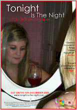
In our fourth draft we again changed the image as we thought that this picture showed emotion discreetly which in our case is good as we didnt want to give the story away too easy to the audience. as the image showed her looking down which is maybe means that she is down and fed up it also shows her slightly smiling which gives the viewers something to think about. We also added in a glass of wine which can also relate to many meanings some of which are feminine, fun and depression. finally the door being closed in the background can represent that she doesn't like to be involved with society she prefers to be closed off from the world. Finally this was the poster we all agreed to use as our final product.

FILM POSTER - exploring fonts

EXPLORING FONTS


Choosing our font type, colour, size and placement took alot of thought as we didnt know if we should have two colours which maybe reflected off each other, whether to have it bold or italic, or even to have the font on two lines. After playing around with the fonts and places we choose to have the font type Century Gothic for out title as we agreed that it looked most sophisticated and professional. We also decided to have two colours and they can play off each other as well as look more intersting. The title was put on two different lines to seperate it up and make it more clear and proficient, the tagline was but in italic therefore clearly showing that it different to the title.

FILM POSTER - setting up mise-en-scene

SETTING UP MISE-EN-SCENE

When we come to doing our poster we decided to have next to no props visible in the background as we didnt want anything taking the attention away from Vicky's face. We thought a medium shot of Vicky's face was best as we wanted to reveal her reflection in the mirror as well, by having her reflection in the mirror this achieves two meangings; as one is reality and the other is just a reflection in other words fake. One of these meanings is of her looking down and fed up with life which is her real image. Although on the other hand we have the basics of the first image but we a slight smile asif she is trying to put on a front, almost like that is how she wants herself to be portrayed. One of the props we did keepis the glass of wine,we kept this because this shows fun, self relief, depression and feminsim which of all these are about our film; therefore we thought this improvised well with our production as it makes the audience think about our poster more and lets them question themselves on our film. Finally the door being closed in the background symbolises that she doesn;t really like to interact with people and likes to be hidden away from the world showing that she isn't really confident with herself or her image.

FILM POSTER - sketching possible images/fonts

SKETCHING POSSIBLE IMAGES/FONTS


We then made a few rough sketches to what our poster may or may not look like, by us doing this gave us an obvious view of what would gain the attention of our target audience or not. We finally found an idea that we thought was appropriate and would draw in the correct target audience for our film just by glancing at it.

FILM POSTER - pitching ideas for poster

PITCHING IDEAS FOR POSTER

Pitching idea's for our poster consisted of us looking at a series of images that are associated with our film plus genre, and then picking the one we think suits it best. After this was done we tryed many different layouts as well as designs since finding the best layout and design was essential for us to attract the correct target audience. For the reasons that if our film poster was dark and unexciting it may not attract any kind of audience or on the other hand may draw in the wrong audience.

We then made a few rough sketches to what our poster may or may not look like, by us doing this gave us an obvious view of what would gain the attention of our target audience or not. We finally found an idea that we thought was appropriate and would draw in the correct target audience for our film just by glancing at it.

FILM POSTER - analysing conventions of film posters

ANALYSING CONVENTIONS OF FILM POSTERS


Before it was time for us to create our film poster for our film, we analysed and looked at other film posters from a variety of different genres so we could gain a clear idea of what conventions we need to introduce to make it look professional and sophisticated. Also as we studied other film posters it istigated more thoughts from each of us on how we could make our film poster appeal to our target audience in the most effective ways.

The posters above were just some of the film posters we looked at, also conducted by other media students. Since we looked at a range of different genre posters it helped us achieve full insight on the specific images, text fonts and even colour schemes to incorporate in our film poster for our genre and audience; which is young females aged 14-18 and the genre drama.

FILM - organising locations, actors, etc

ORGANISING LOCATIONS, ACTORS, ETC


After we had planned our script and storyboard to every fine detail and were completely certain what we was going to film as well as having a idyllic location in our minds. We got to the stage where we had to find a setting that was available to our group plus where a young female would feel comfortable in acting our main character Vicky. Ultimately we decided to use Rosie Hatton and Vicky Hatton's house after many different suggestions, we thought that this loaction was the best as it possessed everyday attributes with the feeling of an normal household atmosphere which was required for the film.


Since this was Vicky's house it made it easier for us to re-film on short notice as she was available almost all the time, just incase there was a problem with the orginal piece of filming. This setting was also suitable for our film as it was easy for everyone to access making it less uncomplicated to set times to get there and start filming.

FILM -scripting

SCRIPTING

When we had come to a conclusion on what our story was going to be and how it was going to be portrayed. We started to put a script together so we knew exactly what we wanted it to look like and what we wanted in each specific scene, even though our film had no-dialouge we still added screen directions. Therefore when it come to filming this made the film more efficient. As we was making our script it inspired other idea's to commence within the group making our film make more sense and give it more depth.

FILM - developing a pitch

DEVELOPING A PITCH


Developing the pitch was when we first started to decide what our film was going to be about, what genre and how the story was going to set it out. We had to include a beginning, middle and end which all had to be within the set time of five minutes this meant that there was only going to be one story line. Although we could only have one story line we could now focus completely on that and make it as interesting and creative as possible.

We began to pitch our ideas. A few examples of the ideas we came up with were:
-A girl being stood up at a cinema,
-The story of a play ground of young teens,
- A girl getting ready
- Lost in the woods
- Abandend house
- A girl wanting to be famous

After we discussed what story to do we all decided to do the girl getting ready as we thought that there is so many options to what she is getting ready for. We the started to decide what our character would look like and how she would be portrayed to a specific audience as for our film to be successful we need to draw in the right target audience. We all needed to brainstorm what kinds of interests and hobbies she would be into as well as most importantly what she is actually going to be gettin ready for! Although we wont be able to go into too much depth about everything we still should atleast touch the edges on all the Criteria’s that a normal film posseses.

We then had to think if what our plot was going to be about and how we was going to keep the audience interested as we now knew what our character was going to be like.

FILM - research into the target audience

RESEARCH INTO THE TARGET AUDIENCE

A main factor for a film is to choose the right target audience for that picture as not every film appeals to the same audience. When choosing our target audience we took alot of time thinking about who and what age group would be attracted to our film as the events in any film have a huge say to what audience you should aim for. Finally we choose to aim our film at young females aged 14-18 due to the fact that in our film there are girlie clothes, make-up and music. After we decided on this audience we then had to research what hobbies and interests that audience like so we could gain full potential from our advertisements. In addition to this we wouldn't advertise a poster of our film at a rugby pitch as this won't get recognised by young females that are engrossed in girlie possesions.

FILM - researching other short films

RESEARCHING OTHER SHORT FILMS

Before we Started to produce our short film we looked at and done some research on other short films that students or individuals had made, so we could gain an insight to how a short film should be structured. Although our film was based on the genre social realism, therefore it had to be based on real events and locations.

Here are some examples of the short films we watched:


Friday, 15 January 2010

FILM Review

FILM REVIEW

To complete this we had to design, write and find pictures for our film review. Everyone in the group had a seperate section to get on with in this piece as this made it more efficent and easier as well as quicker.I personally had the section of writing the review with another memeber of my group, in this review we had to entail a title and a question which was what's the point of a five minute film? We also included a definition of exactly what a short film is. Futhermore we presented a plot, a verdict and wrote whats good about that film next to each subheading. Before we started this review we researched other magazines like Empire (http://www.empireonline.com.au/), Site and Sound (http://www.bfi.org.uk/sightandsound/) and TotalFilm (http://www.totalfilm.com/).