
 The above image is our first draft on our poster, after it was finished we noticed that we could improve the poster as the original image is quite dark, the text is all the same making it very dull and extremly boring. There was also a bottle in the right hand corner which was there by mistake and didn't really fit in with the poster.
Our second poster was a big improvement as we used a different image which we thought showed her facial expressions, thoughts and emotions in more depth. we also used a range of of font types therofre making it more intersting and fun to read it also makes it look more complexed. We also managed to use a prop of a picture of Vicky and a friend in a frame in the bottom right hand corner of the poster, we thought that this contrasted and made her feelings more clear with her big image; as in the picture with her mate she looks really happy and is enjoying life, whereas in the poster she looks quite fed up and upset.

In our third draft we tried going back to our original image but edited it a bit do we could make the clours more appealing and stand out. Although when finshed it still didn't meet our expectations.

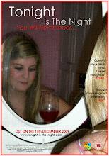
In our fourth draft we again changed the image as we thought that this picture showed emotion discreetly which in our case is good as we didnt want to give the story away too easy to the audience. as the image showed her looking down which is maybe means that she is down and fed up it also shows her slightly smiling which gives the viewers something to think about. We also added in a glass of wine which can also relate to many meanings some of which are feminine, fun and depression. finally the door being closed in the background can represent that she doesn't like to be involved with society she prefers to be closed off from the world. Finally this was the poster we all agreed to use as our final product.


No comments:
Post a Comment