

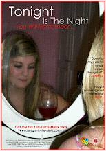
Choosing our font type, colour, size and placement took alot of thought as we didnt know if we should have two colours which maybe reflected off each other, whether to have it bold or italic, or even to have the font on two lines. After playing around with the fonts and places we choose to have the font type Century Gothic for out title as we agreed that it looked most sophisticated and professional. We also decided to have two colours and they can play off each other as well as look more intersting. The title was put on two different lines to seperate it up and make it more clear and proficient, the tagline was but in italic therefore clearly showing that it different to the title.


No comments:
Post a Comment